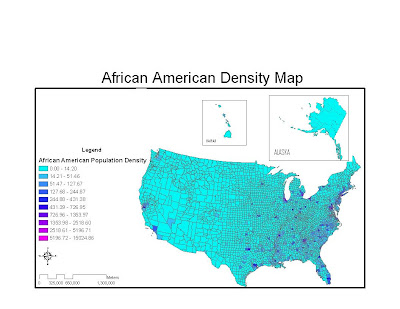
My first map is of “African American’s” and when you look at the map you can clearly see that the East coast and much of the south east has the highest density of African American’s. Another important aspect to notice is how most of the major cities have a high population density of African American’s.

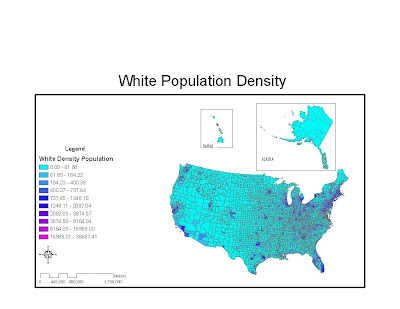
My second map is of “White’s” and this map is much more evenly spread out throughout the map. Particularly in the Midwest they have a much higher population density than African American’s.

Lastly, I thought this lab was very useful because I served as a recruiter in the Marine Corps and we are actually stationed according to the ethnic populations in the area in order to target specific markets. I can also see how important statistics like these are needed for government elections and voting predictions.

Overall, I learned a great deal in this class about manipulating data and creating maps that are aesthetic to even casual viewers. I’ve already used some of this knowledge to create a map to track all the hurricanes in 2005 for my Tropical Climatology class. I look forward to taking more advanced GIS courses and building and what I have learned.

No comments:
Post a Comment