GIS 7

Thursday, June 10, 2010

LAB 8

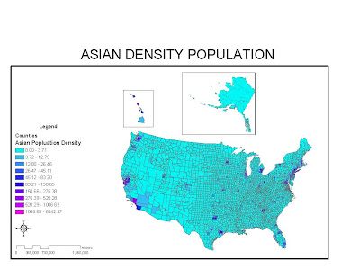
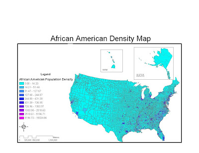
I really enjoyed this lab because other than figuring out the how to incorporate data into a map, everything else was easier to do. Sizing, aligning, and customizing the maps have become much simpler with all the practice we have been getting. Overall, I used the same color palette throughout all three maps in order to better display the density ratios of each race. This allows viewers to distinguish between each and see the distributions better.


My first map is of “African American’s” and when you look at the map you can clearly see that the East coast and much of the south east has the highest density of African American’s. Another important aspect to notice is how most of the major cities have a high population density of African American’s.


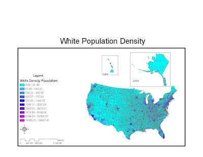
My second map is of “White’s” and this map is much more evenly spread out throughout the map. Particularly in the Midwest they have a much higher population density than African American’s.


Lastly, I thought this lab was very useful because I served as a recruiter in the Marine Corps and we are actually stationed according to the ethnic populations in the area in order to target specific markets. I can also see how important statistics like these are needed for government elections and voting predictions.


Overall, I learned a great deal in this class about manipulating data and creating maps that are aesthetic to even casual viewers. I’ve already used some of this knowledge to create a map to track all the hurricanes in 2005 for my Tropical Climatology class. I look forward to taking more advanced GIS courses and building and what I have learned.

Thursday, May 27, 2010

LAB 8 CALIFORNIA STATION FIRE


In 2009 Los Angeles County had one of the worst fires in its history. The California Station Fire occurred during August in Northern Los Angeles in the Angeles Nation Forest. The fire eventually burned and destroyed over 160 acres of land. While a fire of this magnitude will have dramatic affects overall for not only the environment and surrounding communities, I chose to focus on how it will affect of mudslides in the area. I included two maps one a reference map and the second a thematic map slope/relief area.

The reference map included main purpose show the range of fire and what areas in covered in that time period. The map includes major roads, relief, urban area, and major water bodies. It’s important to see that no major water bodies were in the area of the water which only served to fuel the fire. Additionally, according to new reports the area was suffering from “bone dry conditions” (Angry Fires), this along with no major water systems did not aid fire fighters in stopping the blaze. The map is also useful because is points out how close the urban areas were to the fire. Almost a complete mile of urban communities lies within the one mile buffer I added to the fire area. The massive area that was burned is what will contribute to future landslides and mudslides.

The thematic map I included has the slope/relief of the affected area of the California Fire Station fire. According to the CDC mudslides “Mudslides usually start on steep slopes and can be activated by natural disasters.” (CDC). The natural disaster in this situation is not only the fire but the backfires lit on all the hillsides in order to protect homes. Backfires are controlled burns that allow firefighters to cut off the fire from spreading in certain directions. Unfortunately, this leaves the land bear on sharp slopes and prone to future mudslides. The thematic map and reference map both shows not only that the fire did reach certain urban areas but also came close to others. Lack of vegetation on these sharper surface will serve as launching points or weak areas for mud and landslides in the winter (Gallegos), according to the Pasadena Star news that did an article on the affects of the California Station fire.

Looking at the relief and slopes of the map you can see that certain areas near the fire zone and buffer have high slopes and relief. In the winter when rain falls, it will not require much precipitation to allow debris flows to begin. This is will eventually lead to mudslides and will again endanger the areas closest to the fire. The areas with the higher relief and slope will be the areas that will need the most support and reinforcement in order to protect them from mudslides during the rainy season.

Overall, I found this lab to be the most difficult because it required not only for data to be inserted into ARCGIS but for it to all correspond in some way. Using reference and thematic maps you can analyze disasters and even prevent future episodes from occurring. Reading the CDC, Cal Fire, and FEMA websites prevention was usually their number one goal in preventing certain disasters and analysis of maps plays a big part in that.


Works Cited

UCLA Mapshare, http://gis.ats.ucla.edu//Mapshare/Default.cfm
Accessed on May 25, 2010

John Torigoe, Stephanie ChenCNN, http://www.cnn.com/2009/US/08/31/california.wildfires/index.html
'Angry fire' roars across 100,000 California acres
Accessed on May 25, 2010

Emma Gallegos,Station Fire provides opportunity to understand the science of mudslides, http://www.pasadenastarnews.com/ci_14952909, Accessed on May 25, 2010

Los Angeles County Enterprise GIS, http://gis.lacounty.gov/eGIS/
Accessed on May 25, 2010

http://www.bt.cdc.gov/disasters/landslides.asp
Center for Disease and Control, Accessed on May 25, 2010

Wednesday, May 19, 2010

LAB 7 MAP PROJECTIONl TOPANGA STATE PARK

PROJECTIONS OF TOPANGA STATE PARK NORTH/ TOP: 34.1558
SOUTH/ BOTTOM: 34.0677
WEST/ LEFT: -118.4897
EAST/ RIGHT: -118.3408
Spatial Reference: GCS North American 1983
Datum: D North American 1983


The location I chose for my lab is not unique but is important to many locals and me from the San Bernardino Valley. I chose to generate maps of the Tapanga Valley State Park. I use this park for its expensive running/biking trails and occasionally hike it with my wife. I usually carry a GPS watch when a run/bike through the trails and track the elevation. On my computer, it is just a scatter plot of the elevation and I thought it would be unique to see exactly what it is I traverse 3D.

After creating the map I relived there are still quite a few peaks and valley I probably have not explored. It was quite impressive to see the mountain range and the uniqueness of it from a bird’s eye view. With the slopes map you can see how the winter rains have carved valleys and ravines into the range and it creates a beautiful image when color is added.


Wednesday, May 12, 2010

MAP PROJECTIONS


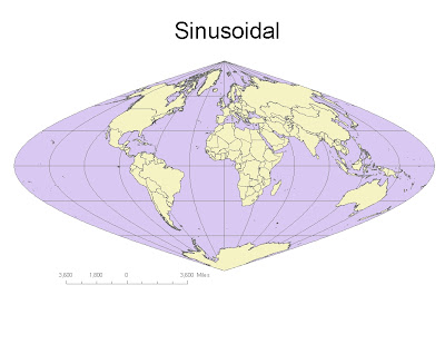
Sinusoidal Equidistant:
Distance from Washington D.C. to Kabul, Afghaninstan: 8,168Mi
Distace at the Equator: 24,884Mi
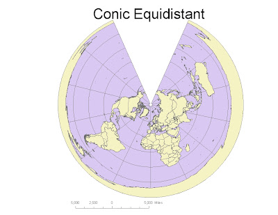


Conic Equidistant:
Distance from Washington D.C. to Kabul, Afghaninstan: 6,985Mi
Distace at the Equator: 25,329Mi
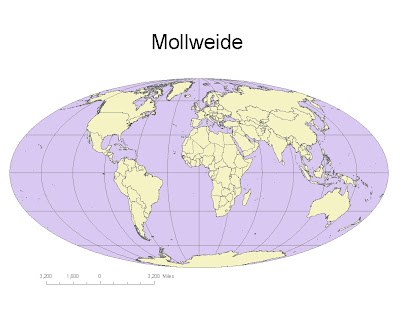


Mollweide Equal Area:
Distance from Washington D.C. to Kabul, Afghaninstan: 7,924Mi
Distace at the Equator: 22,437Mi
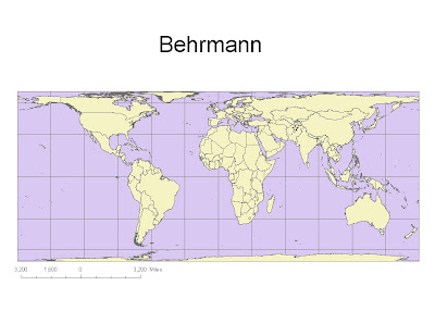


Behrmann Equal Area:
Distance from Washington D.C. to Kabul, Afghaninstan: 8,786Mi
Distace at the Equator: 21,632Mi
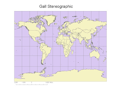


Gall Stereographic Conformal:
Distance from Washington D.C. to Kabul, Afghaninstan: 7,168Mi
Distace at the Equator: 17,168Mi
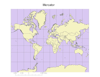


Mercator Conformal:
Distance from Washington D.C. to Kabul, Afghaninstan: 10,105Mi
Distace at the Equator: 24,957Mi


While working with these map projections you quickly realize that unless you choose the right map for your objective, the information you seek could be distorted or inaccurate. Finding a map that fits your purpose is probably one of the most important goals when you using map projections. We worked with three different types of map projections: conformal maps, equal area maps, and equidistant maps.

The conformal maps are good for retaining angles because all the angles are 90 degrees. The downsize to these map types is that as you get closer to the poles you begin to get distortion and progressively gets worse as you go further North or South.

The equal area maps were good for preserving area. Unfortunately, the maps are best suited for targeting certain areas of the world at a time because if not you will get distortion in the angles. These maps are best suited to show different places throughout the world if you don’t mind areas getting distorted in size.

The last projection was the equidistant projections. These are maps I am most familiar with being in the military and conducting planning for logistic movements. These maps are best used in order to preserve distant from one point to the next. The key to using these maps is ensuring you choose a map on the parallel or latitude that you want to get distant from. This will ensure the most accurate numbers when you need distance.

The key to using map projections is choosing the type of map that suits your goals or objectives the best. Additionally, having data on what you want to find or project is also useful because it allows you to pick your projection in accordance with your need.
Wednesday, May 5, 2010

LAB 4: ARCMAP


The ArcMap tutorial was extremely long and required patience to complete. I had to do most of my work remotely, so it lengthened the amount of time it took to complete. While it was a lengthy learning process I felt it I gained a lot from going through the step by step process. Halfway through the tutorial I realized that it would take more time and practice to really grasp the full potential of the ArcMap program.

The ArcMap program does show the potential GIS systems have. The ability to put so much detailed data onto a map is incredible. Layering creates the potential to modify your map whenever necessary and gives you flexibility in your use of the maps. GIS, also gives you the ability to visually compare data and analyze figures using geography. It also allows users to make queries and print out maps without too much difficulty.

There are certain pitfalls in using GIS programs. The major pitfall is that the average user can’t just get on the GIS program and use it. After going through the tutorial it became quite apparent that much practice is needed in order to not only master the program but even to use most of the basic tools. Another, pitfall is that these maps are user created and could have errors within the data.

Overall, I think the experience of using ArcMap was positive and demonstrated the vast capabilities that GIS allows. While it is a lengthy in terms of time to learn the programs, it provides the users with a valuable tool.

Thursday, April 15, 2010

Week3: My vacations 2009


View My vacations 2009-2010 in a larger map


I decided to create a neographic map of the different vacation spots a visited in 2009. Creating mashup map I used my personal pictures and videos of the cities I visited so you could get a personal perspective of the areas. My map has mostly food spots because I feel you could learn a lot about a city by exploring the diverse foods that are available. I also include some of my favorite spots for entertainment with the family and friends.

There are benefits, pitfalls, and consequences of creating neographic maps. The benefit of these maps is how personal they are to the user. The viewers benefit from this because they get to see a different side of something that most likely wouldn’t exist on standard sites. Additionally, adding a personal touch to these types of maps allows viewers to connect with the user because of his/her likes and dislikes. The negatives or pitfalls are that these sites could potentially discourage people because of personal opinion stated on the site. The user could also place inaccurate information about a place/event and further discourage people from exploring these places on their own. The consequences are that many viewers may be disheartened to explore or investigate different places on their own and solely rely on someone else’s opinion. Further, some information could be inaccurate and cause severe disappointment if you solely rely on this information.

Monday, April 12, 2010

1: Beverly Hills Quadrangle

2: Canoga Park, Van Nuys, Burbank, Topanga, Hollywood, Venice, Inglewood

3: 1966

4: North American datum 1927; North American Datum 1983; National Geodetic Vertical Datum of 1929

5: 1:24000

6: A: 1200meters

B: 1.895 miles

C: 2.64in

D: 12.5 cm

7: 20ft

8: A: 118 26' 21" East, 34 04' 28" North
-118.439205, 34.074453

B: 118 29' 59" East, 34 00' 27" North
-118.499715, 34.007598

C: 118 24' 44" East, 34 5' 55" North
-118.412361, 34.098728

9: A: Greystone Park 540ft/ 165m

B: Woodlawn 140ft/ 42.7m

C: Crestwood 620ft/189m

10: UTM ZONE 11

11: North 3763km, East 361.5km

12: 1 km sq

13:


14: positive 14 degrees

15: From north to south

16: